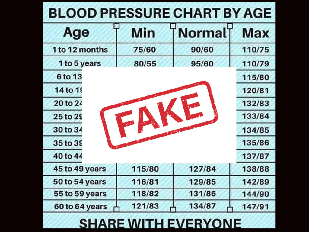

The viral blood pressure by age chart has been circulating on social media for almost 10 years by now. It purports to show fixed “minimum,” “normal,” and “maximum” blood pressure values for different age groups, from infants to seniors. Despite its wide spread, this chart is not from any reputable medical organization. In fact, its simplistic breakdown by age is misleading and not supported by real health guidelines.
No Official Source Endorses This Blood Pressure By Age Chart
No legitimate health authority – not the American Heart Association (AHA)B, the World Health Organization (WHO), the European Society of Cardiology (ESC) – has published a blood pressure chart that assigns higher “normal” values with increasing age.
On the contrary, these organizations have clear definitions of normal blood pressure that apply to all adults, regardless of age. There is no official medical guideline that says a 60-year-old’s blood pressure is “normal” at 134/87, as the viral chart suggests.
It’s important to note that until a few years ago, some guidelines did treat older adults a bit differently in terms of when to start treatment. For instance, prior to 2017, U.S. guidelines didn’t recommend medication for many seniors until their readings exceeded 140/90 or even 150/80 mmHg.
However, modern guidelines have removed age-specific thresholds for defining hypertension. As Harvard Heart Publishing explains, the latest consensus is that the same healthy blood pressure targets apply to younger and older adults.
In other words, health experts now generally “maintain the same blood pressure recommendations for all populations,” even though factors like age or sex can influence one’s risk. This means an older person is not given a free pass to have higher blood pressure – the goal is still to keep it in a lower, safer range if possible.
What Real Blood Pressure Guidelines Say
Blood pressure (BP) is measured as two numbers (for example, “120/80”) in millimeters of mercury (mmHg) – this unit comes from how pressure was first measured using mercury columns. The first (upper) number is the systolic pressure, which is the pressure in your arteries when the heart contracts (beats). The second (lower) number is the diastolic pressure, which is the pressure when the heart rests between beats. A blood pressure reading tells how hard your heart is working to pump blood. Doctors categorize adult readings into ranges to assess if your blood pressure is healthy. According to AHA/ACC guidelines and many public health agencies:
- Normal blood pressure: Less than 120/80 mmHg. This is the ideal range associated with lower cardiovascular risk. (For context, mmHg means millimeters of mercury, the standard unit for blood pressure.)
- Elevated (pre-high) blood pressure: Systolic 120–129 with diastolic still under 80 mmHg. This is a warning zone – not yet hypertension, but higher than ideal.
- High Blood Pressure – Stage 1 (Hypertension): Systolic 130–139 or diastolic 80–89 mmHg. At this stage, lifestyle changes are usually recommended, and doctors will monitor closely.
- High Blood Pressure – Stage 2: Systolic 140+ or diastolic 90+ mmHg. This is a more serious level of hypertension where medication is often considered.
- Hypertensive Crisis: 180/120 mmHg or higher, with potential acute symptoms – this requires immediate medical attention.
Crucially, age is not part of these definitions. A 30-year-old and a 60-year-old are both judged by the same blood pressure criteria above. If an adult’s BP is consistently, say, 135/85 mmHg, that is considered above normal – it doesn’t suddenly become “normal” just because the person is older. In fact, under current guidelines a reading of 134/87 mmHg (the viral chart’s “normal” for a 60-year-old) falls into the high blood pressure (Stage 1) category for any adult. This illustrates why doctors are concerned that the viral chart could falsely reassure older individuals. Someone in their 60s with 134/87 might think their blood pressure is fine “for their age,” when in reality it may indicate hypertension that needs attention.
What about children and teenagers? It’s true that normal blood pressure in childhood is lower than in adulthood, and it gradually rises as kids grow. The viral chart does list lower values for infants and young kids (e.g. “normal” 90/60 for 1-year-olds, 105/70 for teens). However, pediatric blood pressure isn’t evaluated by a simple one-size-fits-all number per age. In practice, doctors use percentiles that account for a child’s age, sex, and height to determine if their blood pressure is normal. There are reference charts showing ranges – for example, an infant might have a typical blood pressure anywhere from about 87/53 up to 105/66 mmHg depending on their exact age and size. School-age children and adolescents see an expected gradual increase in BP with age and body growth. So even for kids, a range of healthy values is considered, not one fixed “normal” number. By the time we reach our late teens and early 20s, blood pressure usually stabilizes into the adult range (around 120/80 or a bit less). From that point onward, 120/80 mmHg remains the general optimal goal throughout adulthood, barring individual variations.
It’s worth noting that as people get older, it is common for blood pressure to creep up. Blood vessels stiffen with age, and decades of gradual plaque buildup in arteries can raise resistance to blood flow. This is why average blood pressures tend to increase in the elderly. For example, studies have found that men often maintain ~120/80 mmHg up to middle age, but after about 50 years old, systolic pressure (the top number) rises while diastolic (bottom number) may drop slightly. Women’s blood pressure on average stays lower than men’s through young adulthood, but after menopause women see a notable rise in systolic pressure. Age is a risk factor for hypertension – the older you are, the greater the likelihood of having high BP. However, “average” or typical readings at older ages should not be confused with the healthy normal range. Medical experts still advise trying to keep blood pressure controlled to under 130/80 if possible, even in one’s 60s and 70s, because lower blood pressure is associated with lower risk of heart attacks and strokes. There may be some exceptions made for the very elderly (for instance, UK doctors often consider up to ~150/90 mmHg acceptable in patients over 80, to avoid overly aggressive treatment). But these are clinical judgment calls – they are not blanket “new normals” for a given age. In general, the target for a healthy blood pressure stays the same throughout adult life.
Why the “Blood Pressure by Age” Chart Is Misleading
The viral chart’s fixed numbers by age can be harmful because they might cause people to misinterpret their blood pressure readings. Here are a few reasons this chart is not a reliable guide:
- It redefines “normal” in a way no expert source does: By implying that 134/87 mmHg is a normal blood pressure at age 60+, the chart directly contradicts established definitions of hypertension. As noted, a 134/87 reading is actually considered high for an adult. An older adult seeing this chart might wrongly believe their elevated blood pressure is healthy “for their age” and delay seeking treatment or lifestyle changes. High blood pressure is often called a “silent killer” because it usually has no symptoms – so misclassifying a high reading as “normal” can be especially dangerous.
- It can cause confusion for younger people: The chart suggests that a 20-year-old should have about 120/79 mmHg and that anything near 130/80 at that age is the maximum. In reality, if a young adult consistently has, say, 128/80, that’s still within an acceptable range (borderline elevated), not an urgent problem. Conversely, if a fit 25-year-old’s blood pressure is only 105/70, that’s perfectly fine – but the chart might make it seem “low” compared to the listed normal of 120/79 for 20–24 years. This kind of rigid thinking isn’t how doctors evaluate blood pressure. Individual variation and context matter more than an age-based table.
- It ignores other health factors: Blood pressure is influenced by many factors besides age – including weight, diet, physical activity, stress, medications, and underlying health conditions. The chart does not account for any of these. Two people of the same age can have very different blood pressures: one 60-year-old might be 118/70 (thanks to healthy lifestyle or genetics), while another is 140/90. The 118/70 is healthy for that person (even though it’s below the chart’s “normal” for 60–64), and the 140/90 is high and needs attention (even though it’s close to the chart’s “max” for that age). Good medical practice focuses on the individual, not a one-size-fits-all chart. As the Heart Research Institute notes, “a normal blood pressure varies from person to person” and doctors will judge it in the context of your overall health.
- Children’s blood pressure can’t be summed up in one line per age group: Pediatric hypertension is defined using percentile curves, not fixed cutoffs, because kids’ bodies are constantly growing. The viral chart’s numbers for children (e.g. “95/65” for a toddler) are oversimplified. Some healthy toddlers might have slightly lower or higher readings than 95/65 on a given day. A single number doesn’t capture the full range of normal. Pediatric experts instead use detailed charts and calculators that factor in the child’s height percentile and sex to decide if a blood pressure reading is concerning.
The “Blood Pressure Chart by Age – Share With Everyone” is not based on any standard or scientific source. It appears to mix a bit of truth (the fact that typical blood pressure increases with age) with a lot of misleading implication (that it’s okay for it to be high just because you’re older). This can lead to a false sense of security in those who actually have hypertension and need to manage it. It might also cause unnecessary alarm or confusion in others.
There is no magic chart that tells you an acceptable blood pressure for each age. Trusted health organizations emphasize standard healthy ranges and individualized care over such simplifications. If you come across the “Blood Pressure Chart by Age” on social media, take it with a grain of salt – or better yet, don’t “share with everyone.” Instead, share the accurate message that ideal blood pressure doesn’t really change with age: we should all aim for readings around or below 120/80 mmHg for optimal health. Always refer to validated medical advice and consult healthcare professionals to understand your blood pressure and how to keep it under control. Your heart and arteries don’t read internet charts – they’ll thank you for sticking to real medical guidance.
Who is behind
The individual or organization behind the Daily Health Gen Facebook page and its associated website, DailyHealthGen.com, remains unidentified. The domain registration details are protected by privacy services, and no public records disclose the registrant’s name or contact information. Similarly, the Facebook page does not provide any information about its administrators or affiliated entities.
Earliest Known Origin
The earliest traceable appearance of the “Blood Pressure Chart by Age – Share With Everyone” image can be linked to a Facebook page called Daily Health Gen around mid-2015. A health blogger noted on September 3, 2015 that a cousin had shared this chart on Facebook – the blogger reposted it with “Picture credit Daily Health Gen”. This suggests the chart was created or first popularized by the Daily Health Gen page. The image itself was a simple table listing minimum, normal, and maximum blood pressure values for various age ranges (from infants to seniors), and it prominently featured the tagline “SHARE WITH EVERYONE” at the bottom. Daily Health Gen’s logo or name was watermarked on the graphic, indicating they were the original source or distributor. The chart did not cite any medical authority or source for its data, which is a clue that it was a user-generated viral graphic rather than an official health guideline chart.
Daily Health Gen was a popular social-media health page (with over half a million followers) known for shareable health tips and infographics. They likely designed the chart in 2015 as part of their content. The original Facebook post (circa mid-2015) included explanatory text about blood pressure, stating for example that “the best blood pressure is 120 over 80, or even lower,” and that “if your blood pressure is 140 over 90, you have high blood pressure”, encouraging readers to take note. This caption text accompanied the image and further helped it spread, since many people copied both the chart and its “Good to know” style explanation when resharing.
Early Spread on Social Media and Blogs
From late 2015 into 2016, the chart went viral across social media platforms and blogs. On Facebook, it was widely shared not only by individual users but also by other health-themed pages and groups. For example, by November 2015 other pages were resharing the “Blood Pressure Chart by Age” with the same caption, spreading it to large audiences. The WhatsApp messaging app also became a conduit for the chart’s spread; in India especially, health infographics often circulate as forwards. A WordPress blogger who curates health tips noted that “all information (was) received via WhatsApp” – this blogger posted the blood pressure chart on March 9, 2017, indicating it had been forwarded around in WhatsApp groups by then. In other words, the image had jumped from Facebook into private messaging channels, increasing its reach.
Several blogs and websites were among the first to propagate the chart beyond Facebook:
- In September 2015, the Holistic Wellness Hub blog shared the chart (taken from Facebook) because the author found it useful, explicitly crediting Daily Health Gen as the source. The blog even listed some doctor-advised tips to maintain normal blood pressure, suggesting the author wanted to add context to the viral chart.
- By February 2, 2016, an Indian “GK Blog” (general knowledge blog) also reposted the exact same image (with DailyHealthGen’s watermark) under the title “♥ BLOOD PRESSURE CHART BY AGE ♥”. This shows the chart had reached various online communities by early 2016.
- Traditional media outlets picked it up as well. Notably, a newspaper in Aruba (“Bondia”) printed the chart in its July 12, 2016 edition as a health tip graphic – the exact table with English text and “SHARE WITH EVERYONE” appeared alongside an article by a local doctor about reducing salt intake. This is an example of how far the chart had spread globally: it transcended online-only circulation and entered print media in different regions (even where English isn’t the primary language, the chart was used as-is).
By 2016, the chart was ubiquitous on Facebook, often being posted in health and wellness groups and community pages. Many users treated it as a handy reference, despite its lack of medical attribution. The viral nature is evident from the frequency of reposts: one Facebook page of a clinic re-shared the image with the “Good to know” caption, and numerous Pinterest pins saved the Facebook-hosted image throughout 2016 and 2017. The chain reaction from one page’s post to countless shares on social networks and messaging apps fueled the chart’s rapid spread.
Attribution and Possible Creators
No official health organization has ever claimed ownership of this chart; it appears to be a crowd-sourced or informally compiled reference. The data in the chart doesn’t match one specific standard from authorities like the American Heart Association (which generally defines one normal BP range for adults, not a sliding scale by age). This reinforces that it was likely made by a social media content creator. All signs point to the Daily Health Gen team (or individual admin) as the original creator or compiler of the chart. Their watermark and the style of the image (similar to other Daily Health Gen graphics of that time) suggest it was part of their content strategy to generate shares. Daily Health Gen was known in 2015 for producing viral wellness infographics (some of which were covered by sites like Bored Panda and MyModernMet), so this blood pressure chart fits that pattern. We do not have the name of a single individual designer from Daily Health Gen, but the page’s branding is the only attribution that ever appeared on the image.
Other groups sometimes removed or obscured the original watermark when resharing, but typically the chart appeared identical. There is no evidence that a government health agency or medical institution made this table; in fact, healthcare professionals often have more complex pediatric blood pressure charts and do not usually prescribe different “normal” BP by narrow adult age brackets. This chart’s simplicity and the “Share With Everyone” tagline point to a grassroots viral creation rather than an official chart.
Later Versions and International Adaptations
Over time, the content of the chart remained largely the same, but it did get repackaged in various formats. People have translated or annotated the image for different audiences. For instance, by the 2020s the chart was circulating on Instagram and other platforms in multiple languages. One example from 2025 shows an Instagram video where the English chart is accompanied by a Telugu headline (translating to “what should BP be at each age?”) – the post still includes the English table values and the phrase “SHARE WITH EVERYONE,” demonstrating how the original graphic was reused in a new language context. Similarly, users in other countries have shared the chart as an image without translation (since numerals are universally readable), sometimes adding their own captions in Spanish, Indonesian, etc., or verbally explaining it in YouTube videos and forums. The core graphic with its distinctive age-group table and “Share with everyone” footer has appeared in Spanish-language Facebook posts and other locales, though often the English text remains intact even in non-English postings (as was the case in the Aruba newspaper example).
It’s worth noting that some derivatives of the chart have appeared: a few websites created their own “blood pressure by age” tables (sometimes in text or PDF format) to capitalize on search interest, but these typically use the same or similar values as the viral image. In one case, a stock vector graphic was made in the style of an infographic (for sale on Shutterstock) illustrating a blood pressure chart by age – likely inspired by the popularity of the meme, though that version doesn’t include the “share with everyone” tagline. By and large, however, the viral image did not undergo significant factual changes; it was usually copied verbatim. The main “evolution” was in distribution methods and minor cosmetic tweaks (such as different color schemes or the addition of logos by other pages).
In summary, the “Blood Pressure Chart by Age – Share With Everyone” image first emerged online around summer 2015 via the Daily Health Gen Facebook page. It quickly went viral on Facebook and WhatsApp, appearing on blogs and even in print by 2016. The chart’s creator is not an official source but likely the admins of Daily Health Gen, who watermarked it to encourage sharing. Over the years the chart has been reposted widely, translated or re-captioned in different languages, but its content has remained consistent. The earliest reliably documented instances (September 2015) point to Daily Health Gen’s post as the origin, and no earlier version with another attribution has been found. All later sightings – from early blog reprints to newspaper inclusions – trace back to that unattributed social-media graphic that asked readers to “share with everyone.”
Sources
- Holistic Wellness Hub – “Blood Pressure Chart By Age” (Sept. 3, 2015) – personal blog noting the chart shared on Facebook, crediting Daily Health Gen.
- Yogalife India (Mitul Mehta) – “Blood pressure chart by Age” (Mar. 9, 2017) – blog post of WhatsApp-forwarded health info.
- GK Blog – “BLOOD PRESSURE CHART BY AGE” (Feb. 2, 2016) – early 2016 blog featuring the image.
- Facebook (Daily Health Gen page) – Viral image source; not directly accessible without login, but referenced by third parties.
- Colección Aruba Digital Archive – Transcript of Bondia newspaper (July 12, 2016) showing the chart printed in Papiamento-language health column.
- Instagram/Twitter posts – Continued circulation in later years, e.g. 2022 tweet and 2025 Instagram video with Telugu text.